User Story: Asset Portfolio Management Dashboard
1. Problem Statement
The Asset Manager is tasked with long-term strategic planning for the utility's entire asset base but lacks a unified, real-time tool to do so effectively. This forces a reliance on manually compiled, often outdated, data from disparate systems.
Key Pain Points:
- Lack of a Strategic Overview: Inability to get a quick, consolidated view of portfolio health, risk, and financial standing.
- Inefficient Prioritization: Difficulty identifying which asset categories or age groups pose the most significant risk, leading to subjective investment decisions.
- Weak Justification for Investment: Struggling to build a data-driven business case for multi-million dollar capital requests without a clear link between asset condition and financial risk.
- Unclear Financial Outlook: Inability to quantify and track the "Investment Gap," which is the unfunded liability for replacing failing assets.
Core Problem: The absence of a single, strategic dashboard leads to reactive planning, inefficient capital allocation, and an inability to clearly communicate the financial and operational risks of aging infrastructure to executive stakeholders.
2. Who is the User Facing the Problem?
Primary User: Asset Manager
This individual is responsible for developing the utility's long-term asset management strategy. Their core duties include prioritizing capital investments, managing lifecycle costs, mitigating portfolio-wide risk, and reporting on asset performance to executive leadership. This dashboard is designed as their primary tool for strategic oversight.
3. Jobs To Be Done
For the Asset Manager:
When I need to develop the 5-year capital improvement plan,
But I can't easily visualize which assets are in the worst condition, pose the highest risk, and are driving our investment gap,
Help me by consolidating portfolio health, risk, and financial metrics into a single, interactive dashboard,
So that I can make defensible, data-driven decisions on where to allocate budget for maximum risk reduction and long-term value.
4. Solution
The solution is a strategic Asset Portfolio Dashboard that serves as a command center for the Asset Manager. It translates complex operational data into high-level, actionable insights for capital planning and risk management.
Key Capabilities:
- Strategic KPI Overview: Presents the most critical metrics at a glance: Asset Health Index, Average Remaining Useful Life (RUL), Overall Risk Score, and the Investment Gap.
- Portfolio Segmentation: Breaks down the portfolio by key strategic segments like Asset Category (e.g., Vertical, Horizontal) and Age Profile to quickly identify trends.
- Condition & Risk Visualization: Uses clear, color-coded charts to display the distribution of assets by Health Status (Good, Fair, Poor) and Risk Level (Low, Medium, High).
- Financial Impact Analysis: Features the "Investment Gap" as a core financial metric and tracks the "Emergency vs. Planned" work ratio to measure strategic effectiveness.
- Interactive Drill-Down: Allows the user to click on any data segment (e.g., "High Risk Assets") to filter the entire dashboard and investigate the root causes behind the numbers.
- Automated Watchlists: Surfaces contextual information like "Frequent Failure Assets" and "Overdue Inspections" to inform risk analysis.
- Export & Reporting: Enables one-click export of any dashboard view to PDF or CSV for use in reports and presentations.
5. Major Steps Involved (Asset Manager Workflow)
- Assess Portfolio: The Asset Manager opens the dashboard to begin their quarterly planning. They immediately review the four key KPIs at the top, noting an increase in the Overall Risk Score and the Investment Gap.
- Isolate Problem Area: They identify that 90 assets are categorized as "High Risk" and click on that segment to investigate further.
- Drill-Down Analysis: The entire dashboard filters to this high-risk segment. The manager can now clearly see that these assets are predominantly in the "> 20 years" age band and have a "Poor" health status.
- Formulate Strategy: The data provides a clear conclusion: a specific cohort of aging assets is driving portfolio risk. These 90 assets become the top priority for the upcoming capital plan.
- Justify the Plan: The Asset Manager exports the filtered dashboard view as a PDF. They use this visual evidence in their budget proposal to provide a data-driven justification for funding the replacement of these specific assets.
6. Flow Diagram
Asset Manager - Capital Planning Flow
mermaid
Source
graph TD
A[Login & Open Dashboard] --> B{Review Strategic KPIs};
B -- Risk Increasing? --> C[Click 'High Risk Assets' Segment];
C --> D{Analyze Filtered Dashboard};
D --> E[Correlate Risk with Asset Age & Condition];
E --> F[Identify Specific Assets for Capital Plan];
F --> G[Export View for Report];
G --> H[Submit Data-Driven Budget Proposal];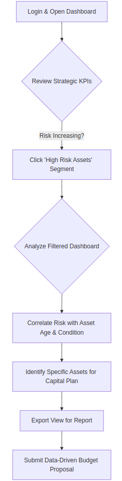
7. Business Rules
General Dashboard Business Rules
These rules apply to the entire dashboard.
- Data Refresh Cadence: The data displayed on the dashboard must be refreshed from the source systems at least once every 24 hours. A timestamp indicating the "Last Updated" time should be visible on the dashboard, perhaps in the header or footer.
- Default View: On loading, the dashboard will default to a "Year-to-Date" (YTD) view.
- Interactivity: All widgets, charts, and KPI cards are interactive. Clicking on a specific segment (e.g., "High Risk Assets," "Poor Condition," "Vertical Assets") will filter the entire dashboard to show data relevant only to that selected segment. Multiple filters can be applied sequentially. An obvious "Clear Filters" or "Reset View" button must be present.
- Trend Indicators: All trend indicators (e.g., ↑ 2.1%) compare the metric's value for the currently selected date range against the value from the immediately preceding equivalent period.
- Example: If the view is "This Quarter," the trend compares against "Last Quarter." If the view is "YTD" as of July 16, 2025, the trend compares against the same date range from the previous year.
- Hover & Tooltips: Hovering over any interactive element (KPIs, chart segments, list items) will change the mouse cursor to a pointer and provide a subtle visual cue (e.g., the element brightens or a border appears). Every dynamic data element will have a tooltip on hover.
- Permissions: The visibility of this dashboard is restricted to users with specific roles, primarily the "Asset Manager" and executive-level roles.
- Export Functionality: An "Export" button will be available, allowing the user to download the current view of the dashboard (with any active filters applied) as a PDF or CSV file.
Filter Options
The dashboard must provide the following filtering capabilities, typically located in a header bar:
- Date Range Filter:
- Functionality: Allows the user to control the time period for which all dashboard data is displayed.
- Default Value: "Year-to-Date" (YTD).
- Options:
- This Month
- This Quarter
- Last Quarter
- This Year (YTD)
- Last 12 Months
- Custom Range (with a start and end date picker).
- Business Rule: All metrics, trends, and lists on the dashboard will recalculate based on the selected date range.
- Hierarchy Filter (Facilities, Systems, Networks):
- Functionality: Allows the user to narrow the dashboard view to a specific part of the asset portfolio.
- Options: A multi-select dropdown or a searchable tree view that lets the user select one or more:
- Facilities
- Systems
- Networks
- Business Rule: Selecting a Facility will automatically include all Systems and Assets within it. Selecting a System will include all its Assets. This provides a powerful way to analyze specific operational areas.
Detailed Business Rules by Dashboard Section
1. Top Navigation Tabs
These tabs suggest the dashboard is part of a larger application.
- Fields: Overview, Financial, O&M, Energy, Inventory, Compliance.
- Business Rules:
- The "Overview" tab is the currently selected view, displaying the Asset Portfolio Health & Condition dashboard.
- Each tab navigates the user to a different dashboard focused on that specific domain.
- The active tab must be visually distinct from the others (e.g., underlined, different color).
2. Strategic KPIs (Top Row)
This section provides a high-level summary of portfolio health.
Field Name | Business Rules & Formula |
| Tooltip Content |
|---|---|---|---|
Asset Health Index | Value (87): A calculated score representing the overall health of the entire asset portfolio. Formula: |
| Title: Asset Health Index Description: "A consolidated score from 0-100 indicating the overall health of the asset portfolio. It combines asset condition, age, and performance data." Formula: |
Total Assets | Value (1,247): A distinct count of all active assets in the portfolio. Formula: Trend (↑ 2.4%): Change in the total number of assets compared to the previous period. |
| Title: Total Assets Description: "The total number of active assets currently being managed in the portfolio." |
Avg RUL | Value (12.4 yrs): The average remaining useful life across all assets. <br> Formula: |
| Title: Average Remaining Useful Life (RUL) Description: "The average number of years remaining before assets in the portfolio are expected to reach the end of their service life." Formula: |
Asset Availability | Value (91%): The percentage of time assets were operational and available to perform their function. <br> Formula: |
| Title: Asset Availability <br> Description: "The percentage of time assets were available to perform their required function during the selected period." <br> Formula: |
Out of Service | Value (115): The count of assets currently in an "Out of Service" or "Inactive" status. <br> Formula: |
| Title: Out of Service <br> Description: "The total number of assets that are currently inactive or not operational." |
Inspection Compliance | Value (92%): The percentage of scheduled inspections that were completed on time. <br> Formula: |
| Title: Inspection Compliance <br> Description: "The percentage of required asset inspections that were completed by their due date within the selected period." <br> Formula: |
3. Asset Categories & Asset Age Profile
These widgets segment the portfolio for strategic analysis.
Widget / Field | Business Rules & Formula |
| Tooltip Content |
|---|---|---|---|
Asset Categories | A breakdown of the asset portfolio by pre-defined categories. Each category shows a count and its percentage of the total. <br> Formula (Count): |
| Title: Asset Category <br> Description: "A breakdown of the portfolio by asset type. Click a category to filter the entire dashboard." |
Asset Age Profile | A breakdown of the asset portfolio by age bands. Each band shows a count and its percentage of the total. <br> Formula (Count): |
| Title: Asset Age Profile <br> Description: "A breakdown of the portfolio by asset age. Click an age band to analyze assets from that generation." |
4. Asset Health Status
This widget visualizes the current condition of the portfolio.
Field Name | Business Rules & Formula |
| Tooltip Content |
|---|---|---|---|
Good/Fair/Poor Condition | Each card represents a health status category. <br> Value (e.g., 734): |
| Title: [Good/Fair/Poor] Condition <br> Description: "The total number and percentage of assets currently assessed as being in [Good/Fair/Poor] condition. Click to filter the dashboard." |
5. Performance & Reliability
This section focuses on operational performance metrics.
Field Name | Business Rules & Formula |
| Tooltip Content |
|---|---|---|---|
Portfolio Failure Rate | Value (2.3%): The percentage of assets that experienced a failure during the period. <br> Formula: |
| Title: Portfolio Failure Rate <br> Description: "The percentage of assets that have had at least one failure in the selected period." |
Avg MTBF | Value (720 hrs): Mean Time Between Failures. The average time an asset operates before it fails. <br> Formula: |
| Title: Average Mean Time Between Failures (MTBF) <br> Description: "The average operational time between failures for assets across the portfolio. A higher number is better." |
Service Level Achievement | Value (91.5%): The percentage of time the utility met its defined service level targets (e.g., water pressure, flow rates). <br> Formula: |
| Title: Service Level Achievement <br> Description: "The percentage of time that operational service levels (e.g., pressure, flow) were met." |
Non-Revenue Water | Value (18.5%): The percentage of water produced that is lost before it reaches the customer. <br> Formula: |
| Title: Non-Revenue Water (NRW) <br> Description: "The percentage of treated water that is lost or unaccounted for before it reaches the customer. A lower number is better." |
6. Frequent Failure Assets
This widget highlights problematic assets needing immediate attention.
- Business Rules:
- This list displays the top 3-5 assets with the highest number of failure-related work orders in the last 6 months.
- Each entry must display:
- Asset Name: The common name of the asset.
- Failure Count: "X failures in 6 months."
- Last Failure Date: The date of the most recent failure.
- The background color of the card indicates the asset's risk level (Red = High, Yellow = Medium).
- Action Button (Inspect/Schedule/Review): The button text is dynamic based on the recommended next step. Clicking it should open a pre-populated work order or take the user to the asset's detailed page.
- Data Source: CMMS work order history, filtered for "corrective" or "failure" types.
- Tooltip Content: On hover over an asset name: "Click to view the detailed asset page. The recommended action is to [Inspect/Schedule/Review] this asset due to its high failure rate."
7. Risk & Strategic Impact
This section translates asset condition into financial and strategic risk.
Field Name | Business Rules & Formula |
| Tooltip Content |
|---|---|---|---|
Overall Risk Score | Value (6.2): The average risk score across all assets. <br> Formula: |
| Title: Overall Risk Score <br> Description: "The primary indicator of portfolio vulnerability, tracking the effectiveness of risk mitigation strategies." <br> Formula: |
High-Risk Assets | Value (90): The count of assets classified with a "High" risk score. <br> Formula: |
| Title: High-Risk Assets <br> Description: "The total number of assets that are classified as 'High Risk' based on their probability and consequence of failure." |
Investment Gap | Value ($2.8M): The unfunded liability for replacing assets in poor condition. <br> Formula: |
| Title: Investment Gap <br> Description: "A critical financial metric that quantifies the funding shortfall for necessary asset replacements." <br> Formula: |
Emergency vs Planned | Value (35:65): The ratio of emergency/unplanned work orders to planned/preventive work orders. <br> Formula: |
| Title: Emergency vs Planned Work <br> Description: "The ratio of reactive (emergency) work to proactive (planned) work. A higher ratio of planned work indicates better strategic control." |
8. Risk Assessment & Recently Added Assets
Widget / Field | Business Rules & Formula |
| Tooltip Content |
|---|---|---|---|
Risk Assessment | A breakdown of the portfolio by risk level. <br> Formula (Count): |
| Title: Risk Level <br> Description: "A breakdown of the portfolio by risk level. Click a level to filter the entire dashboard." |
Recently Added Assets | A chronological list of the 4-5 most recently added assets to the portfolio. <br> Business Rule: Displays the Asset Name, Asset Category (via icon and text), and the date it was added/commissioned. The "New" tag should be displayed for assets added within the last 30 days. |
| Title: Recently Added Asset <br> Description: "The newest assets added to the portfolio. Click to view the asset's detail page." |
9. Overdue Inspections
This widget is an action list for immediate operational attention.
- Business Rules:
- This list displays assets with inspections that are past their due date, ordered by urgency/risk.
- Each entry must display:
- Asset Name: The common name of the asset.
- Due Date: The date the inspection was due.
- Priority/Risk Level: A visual tag (e.g., "high," "medium," "low") indicating the risk associated with missing this inspection.
- Action Button (Urgent/Schedule): The button text is dynamic. Clicking it should open a pre-populated work order for the overdue inspection.
- Data Source: The Inspection/Maintenance module (CMMS), filtering for work orders where
Work_Order_Type = 'Inspection',Status != 'Complete', andDue_Date < Current_Date. - Tooltip Content: On hover over an asset name: "This inspection is [X] days overdue. The priority is [High/Medium/Low]. Click 'Schedule' to create a work order."
8. Sample Data
Asset Name | Asset Category | Age (Yrs) | Condition | Risk Score | Replacement Cost |
|---|---|---|---|---|---|
Pump Station #7 | Vertical Asset | 22 | Poor | 8.5 | $250,000 |
Main Feeder Line B | Horizontal Asset | 35 | Poor | 9.2 | $1,200,000 |
Water Treatment Plant #1 | Facility | 25 | Poor | 8.1 | $5,000,000 |
Generator Unit A | Horizontal Asset | 18 | Fair | 6.5 | $150,000 |
9. Acceptance Criteria
- The system must display the four primary KPIs: Asset Health Index, Avg RUL, Overall Risk Score, and Investment Gap.
- The system must calculate the Investment Gap using the defined formula.
- The system must correctly categorize assets into the defined "Asset Categories" and "Asset Age Profile" bands.
- The system must display the total count and percentage of assets in "Poor Condition."
- The system must display the total count and percentage of assets at "High Risk."
- Clicking the "High Risk Assets" widget must filter all other widgets on the dashboard.
- Clicking the "Poor Condition" widget must filter all other widgets on the dashboard.
- The "Emergency vs Planned" work ratio must be displayed.
- Trend arrows next to each KPI must accurately compare the current period to the previous period.
- All KPIs must have a tooltip explaining the business meaning and calculation formula.
- The "Frequent Failure Assets" widget must list assets with the most failures in the last 6 months.
- The dashboard must provide an "Export to PDF" option.
- The dashboard must load completely within 5 seconds for a portfolio of up to 10,000 assets.
- The data on the dashboard must be refreshed at least once every 24 hours.
- All interactive elements must provide a visual cue on hover.
10. Process Changes
From (Current Process) | To (New Process) | Impact Analysis |
|---|---|---|
Spending days in spreadsheets to model risk and justify budgets. | Using the dashboard to instantly identify high-risk segments and quantify the investment gap. | Reduces annual capital planning preparation time by an estimated 30-40%, freeing up the manager for more strategic tasks. |
Budget meetings rely on anecdotal evidence and high-level summaries. | Budget meetings are driven by clear, visual data from the dashboard showing the link between risk, age, and funding. | Increases credibility and leads to more effective, data-driven capital allocation. |
Risk is assessed periodically as a major, time-consuming project. | Risk is monitored continuously via the "Overall Risk Score" KPI. | Enables agile strategy adjustments by showing the impact of investment decisions on risk in near real-time. |
11. Impact from Solving This Problem
Metric | How it Improves |
|---|---|
✅ Capital Budget Optimization | Ensures capital is allocated to assets that pose the greatest risk, maximizing the ROI of every dollar spent. |
✅ Proactive Risk Reduction | Focusing investment on "High Risk" assets demonstrably lowers the utility's operational and financial risk profile. |
✅ Strategic Alignment | Provides a clear, data-driven link between operations (asset condition) and financial strategy (capital planning). |
✅ Stakeholder Confidence | Builds confidence with the board and regulators by demonstrating a mature, data-driven approach to asset management. |
12. User Behavior Tracking
Question to Answer | Event to Track | Properties |
|---|---|---|
How often is the Asset Manager monitoring the portfolio? |
|
|
What strategic segments are being investigated most? |
|
|
Are the KPI definitions clear and being used? |
|
|
Is the dashboard being used to create reports? |
|
|
What is the typical analysis path for the manager? |
|
|